Sunday, 10 April 2016
Premiering our final titles
Once we'd shown our final titles to our class and teachers, everyone decided that we'd sorted everything that needed to be corrected and that it was now complete.
Planning our evaluation
For our evaluation, we collectively decided that it would be a good idea to answer the questions together as a voice over of the final titles. We each selected our desired questions and elected the last question to be answered together as a group. We then began to script our own answers, to then read them out to an audio recording device.
Final Editing - 2 - font and placement of font
The majority of our peers dislike our chosen font as it looked too chunky and messy, and looked quite childish. This effected the title sequence as a whole, as it lightened the tone of the plot. To keep the seriousness of the narrative, we would need to choose a neater font that still feels dystopian in appearance. We eventually decided on using Wrong Time, Wrong Place:

Our peers also felt that the main title should instead be nearer to the middle of the sequence rather than the end:
Our peers also felt that the main title should instead be nearer to the middle of the sequence rather than the end:
 |
| FIRST DRAFT |
 |
| FINAL TITLE |
Final Editing - 1 - Blanks
After the feedback was given, I took action upon what our fellow students and our two teachers suggested, and took out some of the black fades. I then replaced them with either normal fades or just a straight cut to the next scene. This is because the black fades are very effective transitions when used in moderation. I overused them so eliminated their desired effect, and this had to be changed. I am now happy with how many are used and they have now sustained their reason of use.
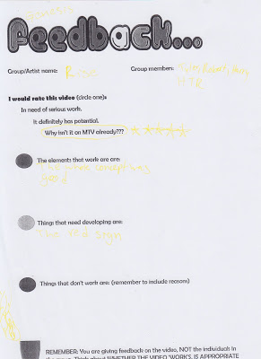
Feedback Sheets
These are the sheets that our fellow students completed after we premiered our first draft in our classroom, so that we can look at what worked well in our sequence and work on the areas that need development:


Subscribe to:
Posts (Atom)