Sunday 10 April 2016
Premiering our final titles
Once we'd shown our final titles to our class and teachers, everyone decided that we'd sorted everything that needed to be corrected and that it was now complete.
Planning our evaluation
For our evaluation, we collectively decided that it would be a good idea to answer the questions together as a voice over of the final titles. We each selected our desired questions and elected the last question to be answered together as a group. We then began to script our own answers, to then read them out to an audio recording device.
Final Editing - 2 - font and placement of font
The majority of our peers dislike our chosen font as it looked too chunky and messy, and looked quite childish. This effected the title sequence as a whole, as it lightened the tone of the plot. To keep the seriousness of the narrative, we would need to choose a neater font that still feels dystopian in appearance. We eventually decided on using Wrong Time, Wrong Place:

Our peers also felt that the main title should instead be nearer to the middle of the sequence rather than the end:
Our peers also felt that the main title should instead be nearer to the middle of the sequence rather than the end:
 |
| FIRST DRAFT |
 |
| FINAL TITLE |
Final Editing - 1 - Blanks
After the feedback was given, I took action upon what our fellow students and our two teachers suggested, and took out some of the black fades. I then replaced them with either normal fades or just a straight cut to the next scene. This is because the black fades are very effective transitions when used in moderation. I overused them so eliminated their desired effect, and this had to be changed. I am now happy with how many are used and they have now sustained their reason of use.
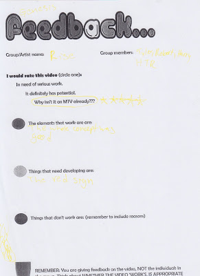
Feedback Sheets
These are the sheets that our fellow students completed after we premiered our first draft in our classroom, so that we can look at what worked well in our sequence and work on the areas that need development:


Fonts - Secret Agency
Adding in the fonts came in once I had finished editing all together all of our footage. However, we had already decided which font we wanted to use.
These were our three initial choices:


We all eventually settled on the second font, Secret Agency:

These were our three initial choices:
We all eventually settled on the second font, Secret Agency:
Audience Profile
Before creating our titles, Harry produced an audience profile of who our film would target:


Editing First Draft - 10 - jump cut
The final piece of footage in our sequence is a long shot of Damon and Sid walking towards, then past, the camera. When editing this scene, I thought jump cuts as they are walking would really add depth to what would be a boring scene of two people walking. I then used slow motion to add an impact to the scene. I was inspired to do this by the end of the music video 'This Is Gospel (Piano Version)' by Panic! At The Disco


Editing First Draft - 9 - throwing fire
For the scene in which Damon throws the Molotov bomb, I again used slow motion to emphasis the action of revolt. I used a dark tint on the footage to again relate it to our theme of despair and oppression and to keep the continuity in low key lighting of our whole sequence. I then applied this to all of the scenes of this part of our sequence.


Editing First Draft - 8 - Fire Fire
When editing the scene of the Molotov Cocktail bomb, I slowed down the close up of Damon holding the bomb when it's on fire. I then discretely used 'vignette' to darken everything surrounding the fire and concentrating the scene on the fire itself. I also slightly adjusted the saturation of this scene, making the fire even brighter than the original footage.


Editing First Draft - 7 - Anna Clarke
The next scene I edited was Anna Clarke's criminal records. This one was edited slightly differently to the others.
We didn't shoot any footage of the character Anna Clarke, as she is supposed to be introduced later in the film and we wanted to maintain this mystery and allow the audience to come up with their own suspicions and ideas of who she may be. So when editing her criminal record footage, instead of flashing up with an image of her mugshot, I used the footage Robert had taken of the forest area. I lowered the Hue to make the scene look darker, more eerie and threatening. I also increased the speed of the footage slightly, making it seem as if the person is running away from someone hunting them.
I also lined the footage up with the beginning of the guitar solo from the non-diegetic soundtrack we had chosen, giving this scene a bigger impact and shocking the audience both visually and audibly with this immediate scene
 |
| Original Footage |
 |
| Edited Footage |
Editing First Draft - 6 - dead body
On the same day that we filmed all of the core footage, we also filmed some scenes that we were not sure whether or not to include in the first draft and final cut of the titles. One of these being a dead body on the street. We took two photos of this, one close up and one extreme long shot. When I came to editing the sequence, I decided to include these two shots. I made them really snappy and they are only seen for a split second before they flash off again. This makes the audience feel as though they have watched something that they weren't supposed to see.

Editing First Draft - 5 - execution scene
When I came to editing the execution scene, I knew I had my work cut out for me. I started off by adding a 'camcorder' filter to the footage. I then started putting this part of the sequence together, cutting between the two different shots of it to maintain pace and expand on our use of angles and shots in the sequence. We also noticed that Robert had accidentally looked up at the camera frequently throughout this scene. To hide this (as well as to add tension to this uncomfortable-to-watch scene) I added a series of static transitions. I chose this transition as it relates to the camcorder effect used, allowing it to become part of the scene rather than just being there to lead to the next. I then further experimented with slow motion: slowing down the moment the innocent man in shot, then speeding it up as he drops to the ground. This emphasis the seriousness of a situation such as this, encouraging the audience to think about what they just witnessed and emerging them in the sequence.


Saturday 9 April 2016
Editing First Draft - 4 - homeless scene
Editing the scene of the homeless man proved to be very difficult, as the day we filmed on was very sunny and we initially wanted a darker tone of lighting for this (low key) to add to the miserable atmosphere of a broken society.
The only way we could do this was to make the footage completely unsaturated, turning it black and white. Overall, however, this worked well with the rest of our footage as it broke up the frequent use of colour:

The only way we could do this was to make the footage completely unsaturated, turning it black and white. Overall, however, this worked well with the rest of our footage as it broke up the frequent use of colour:
Subscribe to:
Posts (Atom)